Learn the four Webflow design foundations
Sections, containers, divs, and classes form the basic structure of most Webflow pages. Add responsive breakpoints and you have a reusable system instead of a collection of isolated elements.
The Designer becomes easier when you understand how its boxes relate to one another.
1. Section
A section is a large horizontal region of a page, such as the hero, services, about, or contact area. Planning the page as a sequence of sections gives the work a clear structure.
2. Container
A section can span the full viewport, but its text should usually remain within a readable width. A container centers the content and limits how wide it becomes.
3. Div
A div groups related content inside the container. A heading, paragraph, and button might live inside one div. Divs can contain other divs, creating a clear hierarchy.
4. Class
A class is a reusable set of styles. Give every primary button the same class, and a change to that class updates every matching button.
This is more reliable than styling each element separately. Use clear names that describe the role, then add a combo class only for a genuine variation.
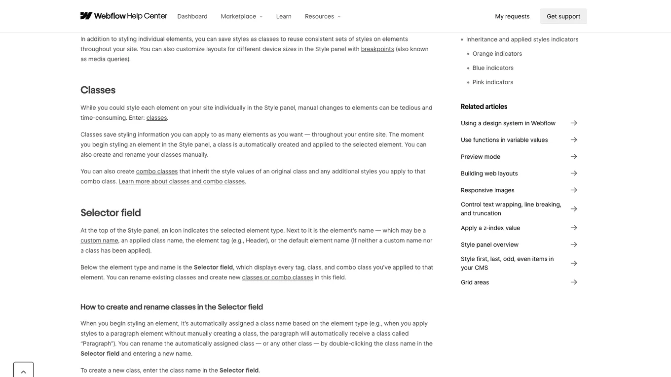
Source: Webflow Help Center, accessed July 2026.
Typography, color, and responsive breakpoints
Apply the same reusable logic to typography and color. A small style guide keeps the site consistent and makes later changes faster.
Then check tablet and mobile breakpoints. Begin with the larger layout and change only what needs to adapt at narrower widths, such as stacking two columns.
Lesson checklist
- I understand the section, container, and div hierarchy
- I use classes for styles that should repeat
- I check and adjust the layout at responsive breakpoints
Next, you will use CMS for repeatable content.