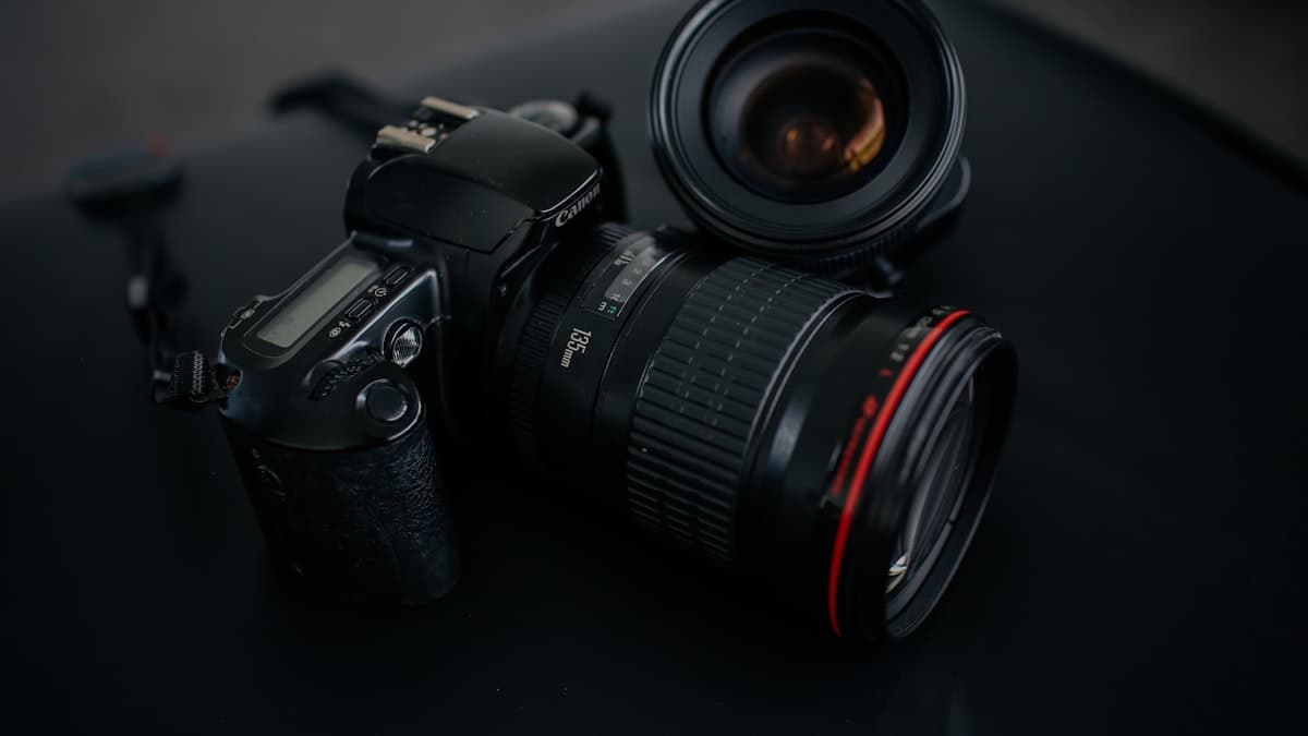
Place Your Product in a Real Use Scene
A product shot on its own shows what something is. A lifestyle shot shows how it fits into someone's life. The second one usually moves conversion more than the first.

Stage this: show [PRODUCT] in a real [SETTING, e.g. wooden kitchen counter / sunlit living room / desk] during natural, everyday use. Add a human touch with [USE-CASE DETAIL, e.g. a hand holding the mug, the product resting on the table next to a book]. Lighting: soft natural morning light coming through a window, warm tone. Camera: 50mm lens feel, eye level, shallow depth of field at f/2.8 so the background blurs softly. Color grade: warm, inviting, editorial tone with a light film grain feel. Material: the product's [MATERIAL] and the setting's [SURFACE MATERIAL, e.g. light-toned wood] should both catch realistic light reflection together. Vertical format, 4:5.
How to use it
- Add it as the second or third gallery photo next to your main listing image.
- Use it as an Instagram or storefront visual that introduces the product without sales language.
- Change the setting or use-case detail to generate several lifestyle variations of the same product.
Example / tip
A handmade candle brand sets the scene as 'a dim, evening living room side table.' The output shows the candle lit, in warm light, next to a book, in an inviting setup.
Usage example
Copy the prompt as is, fill in the bracketed fields for your own product, and paste it into Nano Banana Pro (Gemini) or GPT Image. If you have a real product photo, upload it as a reference so the output stays closer to the actual item. If the first result misses, ask for a one-line fix (e.g. 'soften the light,' 'simplify the background').
When not to use it
Don't force this if you have no real product image; the prompt is meant to show an existing product better, not invent one that doesn't exist. Never drop the output straight into a listing without checking it first. AI generation can still warp material, proportion, or text. Always verify yourself that it matches your brand colors, logo, and the product's actual look.
Output quality checklist
- Does the product look realistic, or is a complex detail (text, proportion, hands) deformed? If so, regenerate or ask for a fix.
- Does it match your brand palette and the product's real material and color, or does it look random?
- Is the aspect ratio right for where it's going (square for listings, vertical for social, 4:5 for ads)?
- If there's text in the image, is it legible and spelled correctly? AI images often mangle text, check it closely.