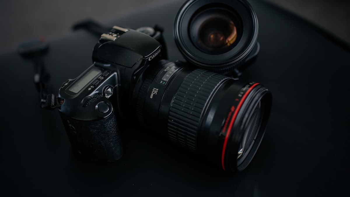
2x2 Multi-Angle Listing Set
One gallery image builds trust faster than four separate photos on some platforms; the customer sees every angle of the product without swiping.

Design this: build a four-angle listing image for [PRODUCT] in a 2x2 grid layout. Top-left panel shows the front view, top-right the side profile, bottom-left a close-up of [DETAIL, e.g. logo or texture], bottom-right a natural in-use scene. Every panel shares the same lighting setup (soft studio softbox) and the same [BACKGROUND COLOR, e.g. light grey] backdrop, so the set reads as one cohesive shoot. Camera: balanced, centered framing in every panel. Color grade: consistent, high-key commercial tone held the same across all four panels. Material: the [MATERIAL] texture reads consistently across all four angles. Vertical format, 4:5.
How to use it
- Use it on platforms where you want one image (the cover photo) to show every angle of the product.
- Use it to give a single frame that 'product tour' feel on social media.
- Use it as the launch visual when you're introducing a new product.
Example / tip
For a brand selling leather bags, the output brings the front view, side view, a zipper close-up, and a worn-on-the-shoulder scene together in one 2x2 grid, all on a consistent grey background.
Usage example
Copy the prompt as is, fill in the bracketed fields for your own product, and paste it into Nano Banana Pro (Gemini) or GPT Image. If you have a real product photo, upload it as a reference so the output stays closer to the actual item. If the first result misses, ask for a one-line fix (e.g. 'soften the light,' 'simplify the background').
When not to use it
Don't force this if you have no real product image; the prompt is meant to show an existing product better, not invent one that doesn't exist. Never drop the output straight into a listing without checking it first. AI generation can still get the material, proportions, or text wrong. Always verify yourself that it matches your brand colors, logo, and the product's actual look.
Output quality checklist
- Does the product look realistic, or is a complex detail (text, proportion, a hand) deformed? If so, regenerate or ask for a fix.
- Does it match your brand palette and the product's real material and color, or does it look random?
- Is the aspect ratio right for where it's going (square for listings, vertical for social, 4:5 for ads)?
- If there's text in the image, is it legible and spelled correctly? AI images often mangle text, check it closely.