Testing your ads and the most common mistakes
Your variants are ready. This lesson covers how to put them through a simple A/B logic on Meta, what to actually look at in the results (clicks and conversions), and the four most common mistakes beginners make.
Your variants are ready, sitting in the panel with their scores. Now the real work starts: finding out which one actually works. Neither AdCreative.ai nor I can tell you that. Only your own ad account can.
Simple A/B logic: the one-variable rule
Testing comes down to one sentence: change only one thing at a time.
When you're racing two variants against each other, keep the budget the same, the audience the same, the copy the same, the offer the same. Only the visual changes. Set it up that way and you can attribute the difference in results to the visual. Change the visual and the audience at the same time, and you'll never know why the winner won.
In practice there are two routes:
Route 1: Put multiple ads in the same ad set. This is the simplest approach. You add a few ads to the same ad set, with only the visual different between them. Meta distributes the budget on its own; over time you watch which visual gets more delivery and which performs better. It's not a clean scientific test (Meta doesn't split delivery evenly), but it's enough signal to start with.
Route 2: Use Meta's own A/B testing tool. Inside Ads Manager there's an A/B test feature that races two ads against each other in a controlled way, splitting traffic for a cleaner comparison.
If you're just starting out, begin with Route 1. Move to Route 2 once you've settled into a regular testing rhythm.
What to look at: clicks and conversion
There are two levels to read your results at, and each answers a different question.
Clicks (CTR): does the visual stop people and get them to click? This measures the visual's ability to grab attention. The first split between variants usually shows up here.
Conversion: does the person who clicked take the action you wanted (purchase, form fill, add to cart)? This is where the real money is. A visual with a high CTR but low conversion may be setting the wrong expectation: it's collecting curiosity clicks but not bringing buyers.
Look at both together. If you decide based on CTR alone, you can end up pouring budget into a visual that "gets clicks but doesn't sell."
I won't hand you a "good CTR is X%" target here. Those numbers swing so much by industry, product, audience, and offer that a single threshold would mislead you. Your real benchmark is your own history: is today's variant better than yesterday's? Always compare within your own account.
 Source: AdCreative.ai, accessed July 2026.
One more thing: patience. Don't judge a test before it has enough data. The first few hours are misleading; let Meta's delivery settle and the results reach a meaningful volume before you decide.
Common mistakes: four traps
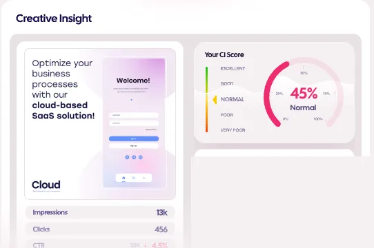
1. Trusting the score blindly. I've said this throughout the series, but it's the most common mistake, so one last time: AdCreative.ai's score is a pre-screening tool, not the decision-maker. If you declare a high-scoring visual "the winner" without ever testing it, you never actually put the tool's prediction through your own money. The score narrows the pool; the test picks the winner.
2. Deciding off a single variant. Running one visual and declaring "the ad doesn't work" is like buying one lottery ticket and declaring "the lottery doesn't pay out." Without a comparison, you don't have information either. Don't judge a visual without racing at least a few variants side by side; growing the variant pool is the whole reason you're using this tool in the first place.
3. Breaking brand consistency. The tool hands you a lot of very different compositions, and each one can look good on its own. The trap: if your ads look completely different every week, your audience can't recognize you. Part of an ad's job is building brand recognition through repeated exposure. You set up your brand kit in lesson two for exactly this reason; let variants differentiate inside that frame, not outside it.
4. Unreadable or overloaded text. Both extremes are mistakes. If the visual carries no message, someone scrolling past has no idea what you're offering. If the text is too long or too small, nobody reads it on a phone. The text on your visual needs to be short and large enough to read at a glance, on a small screen. Before you go live, check the visual on your own phone, at feed size.
What comes after: rhythm
Here's what you've built through this series: you understand why creative is a lever, you learned to set up a brand kit and generate variants, and you saw the simple way to test variants with real money. What comes after is one word: rhythm.
A winning visual doesn't win forever, it wears out over time. Generate new variants on a regular cadence, put them through the test, scale the winner, retire the one that's worn out. The tool speeds up the production side of that loop; the decision side always stays in your ad account.
Lesson checklist
- I understand the one-variable rule: in a variant test, only the visual changes, budget/audience/copy stay fixed
- I know how to race variants on Meta (multiple ads in one ad set, or the A/B test tool)
- I checked that I'm looking at clicks and conversion together when reading results, not deciding on one metric alone
- I know the four traps: trusting the score blindly, deciding off one variant, breaking brand consistency, unreadable visuals
That's the end of the series. The production speed is in the tool now; the decision-making stays in your own data. Keep those two separate, and creative stops being the bottleneck.
You finished this course. I also share updates about these tools in the weekly newsletter: